Scratchboard
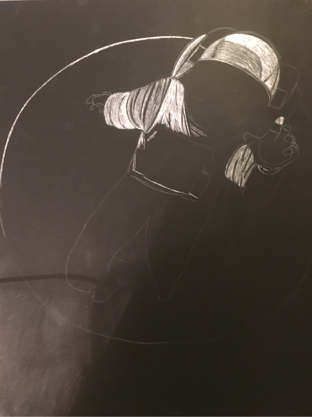
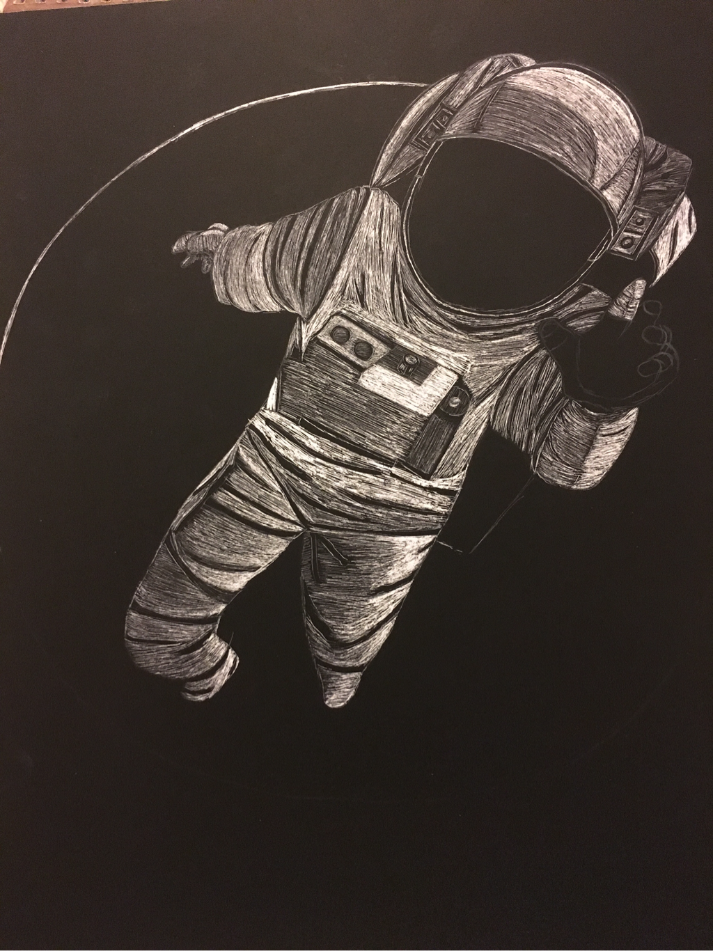
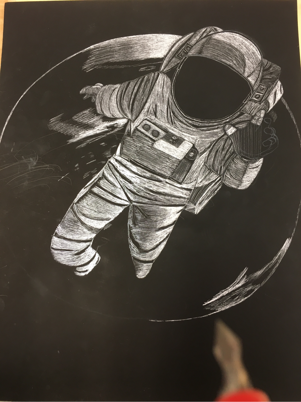
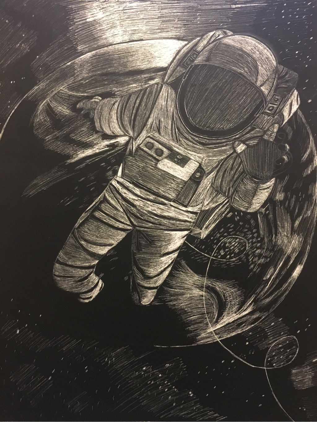
For my scratch board project I decided to make an astronaut floating in space, with the earth in the background. I had never drawn anything like this before, so I wanted to do something new, and also give myself a challenge.
I used texture when making the astronaut suit. By doing this I made sure to create lines going in the same direction, and in order to create shadow I shaded lighter to make highlights, and kept parks dark to create shadow. I also used texture when making the earth. I used lines and shading to create the land and water effect.
I think that my piece has a well-organized composition because I have the astronaut in the foreground, and the earth and sky in the background. By doing the sky I feel like it made a big difference, and really brought the final product together.
I implied movement in my picture by demonstrating that the astronaut was floating in space. I made his arms and legs in different positions, which implies that his whole body was moving in the air.
I think my artwork could use several improvements. For starters I would make sure that my lines were cleaner and that they didn't look so sketchy. Along with that I would have liked to add more intense value. Some areas are lacking really white areas, as well as darker areas (but I feel I get a lot of dark from the sky). Also I would consider doing more planets in the background instead of just doing little stars.
Although I think I could have improved with my values, I think I did a decent job with it anyway. My favorite part is the astronaut's suit because I used more of the white, which made it pop. Also, I kept a lot of black in the background, which made the center of the piece stand out better.
Overall I really enjoyed working with the scratchboard (despite the sound,) and would definitely do another project in the future with it.
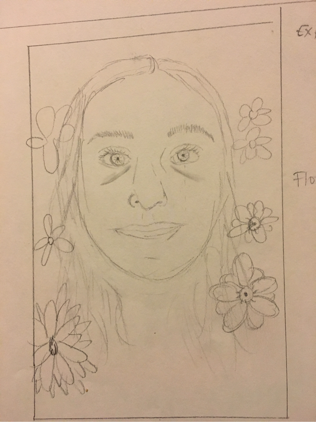
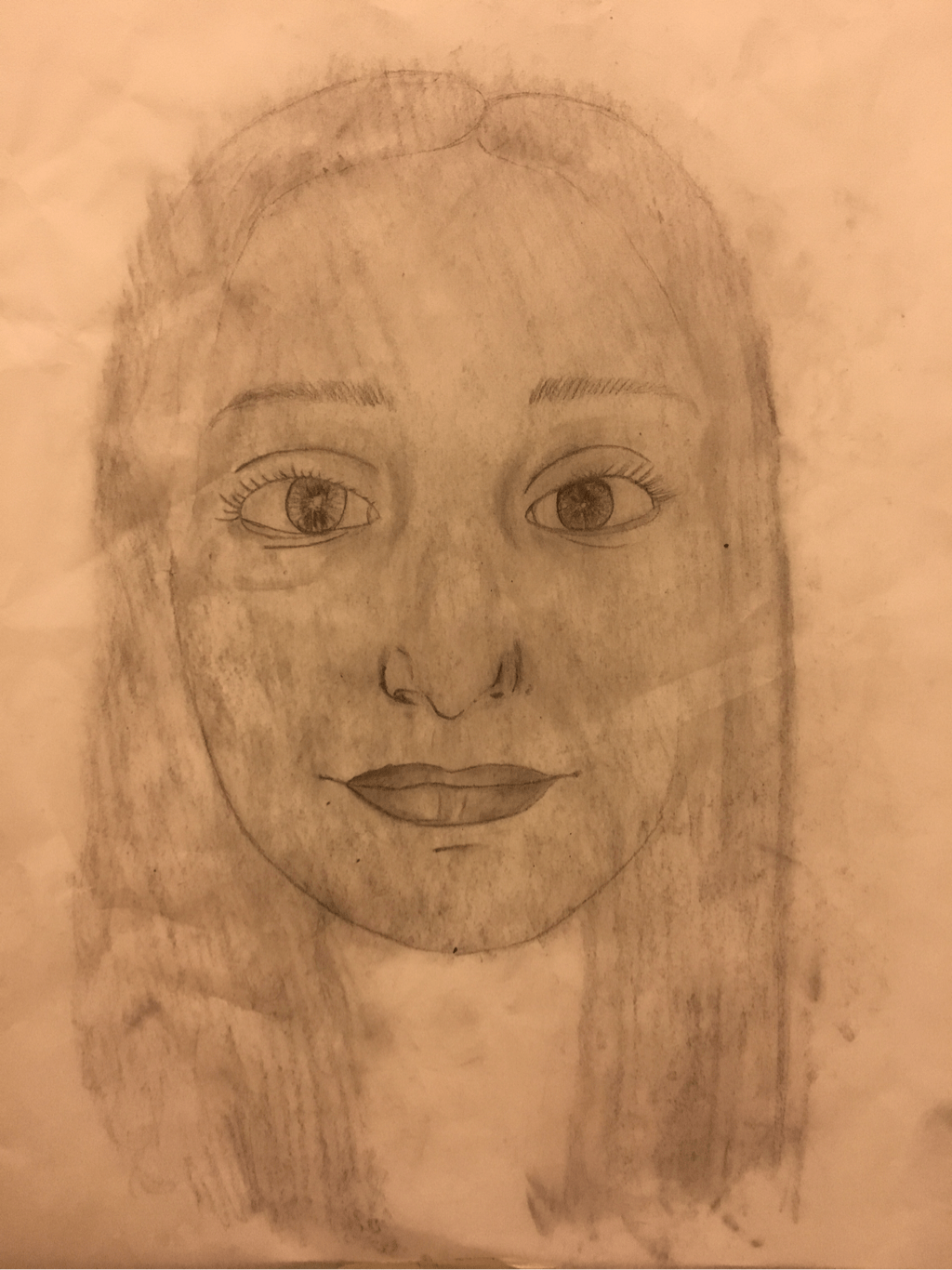
Self Portrait

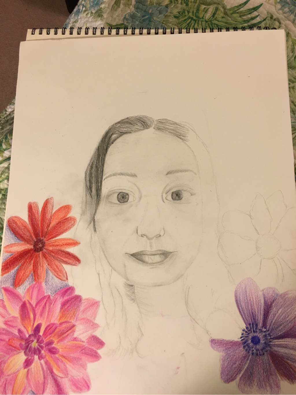
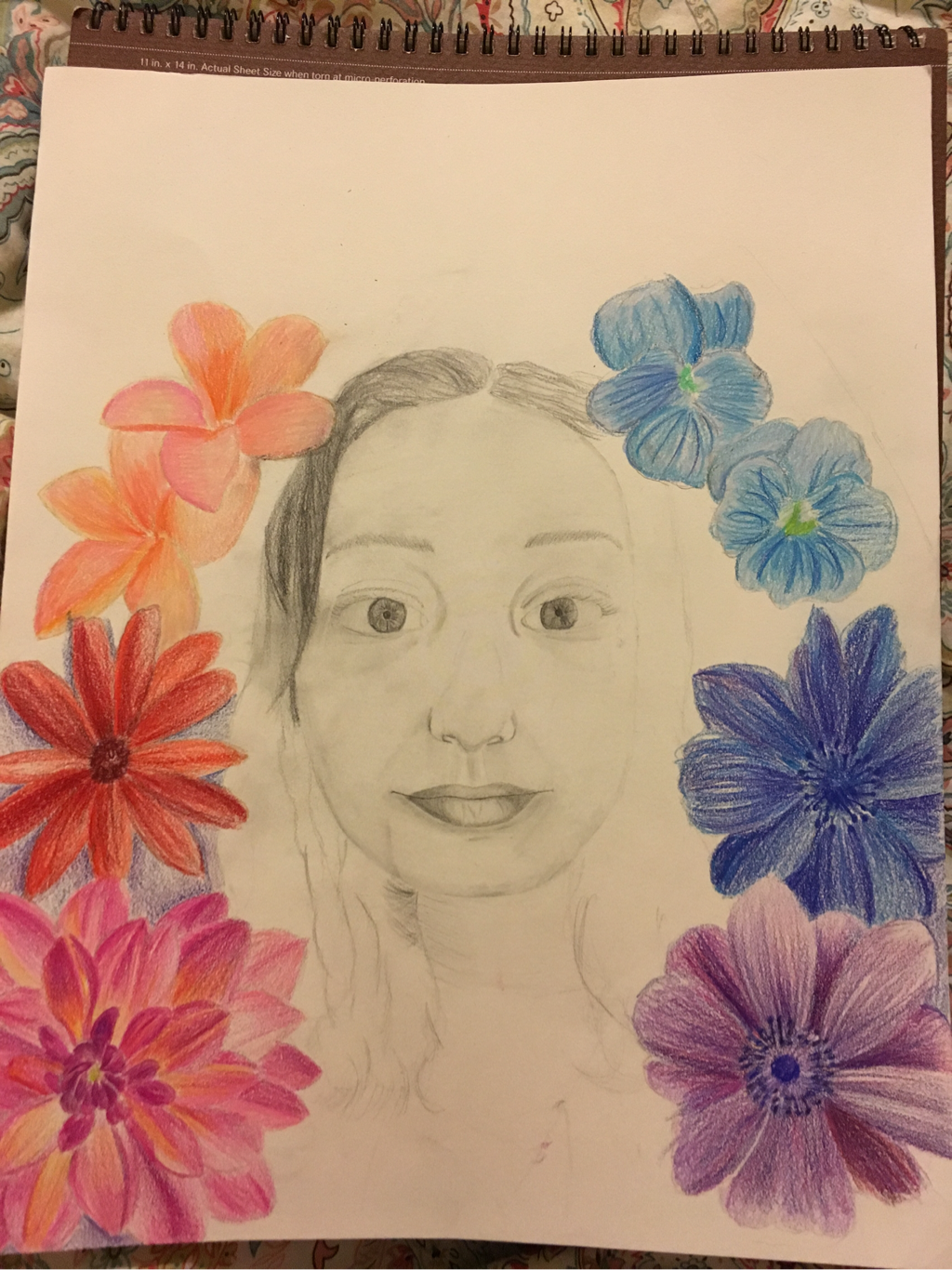
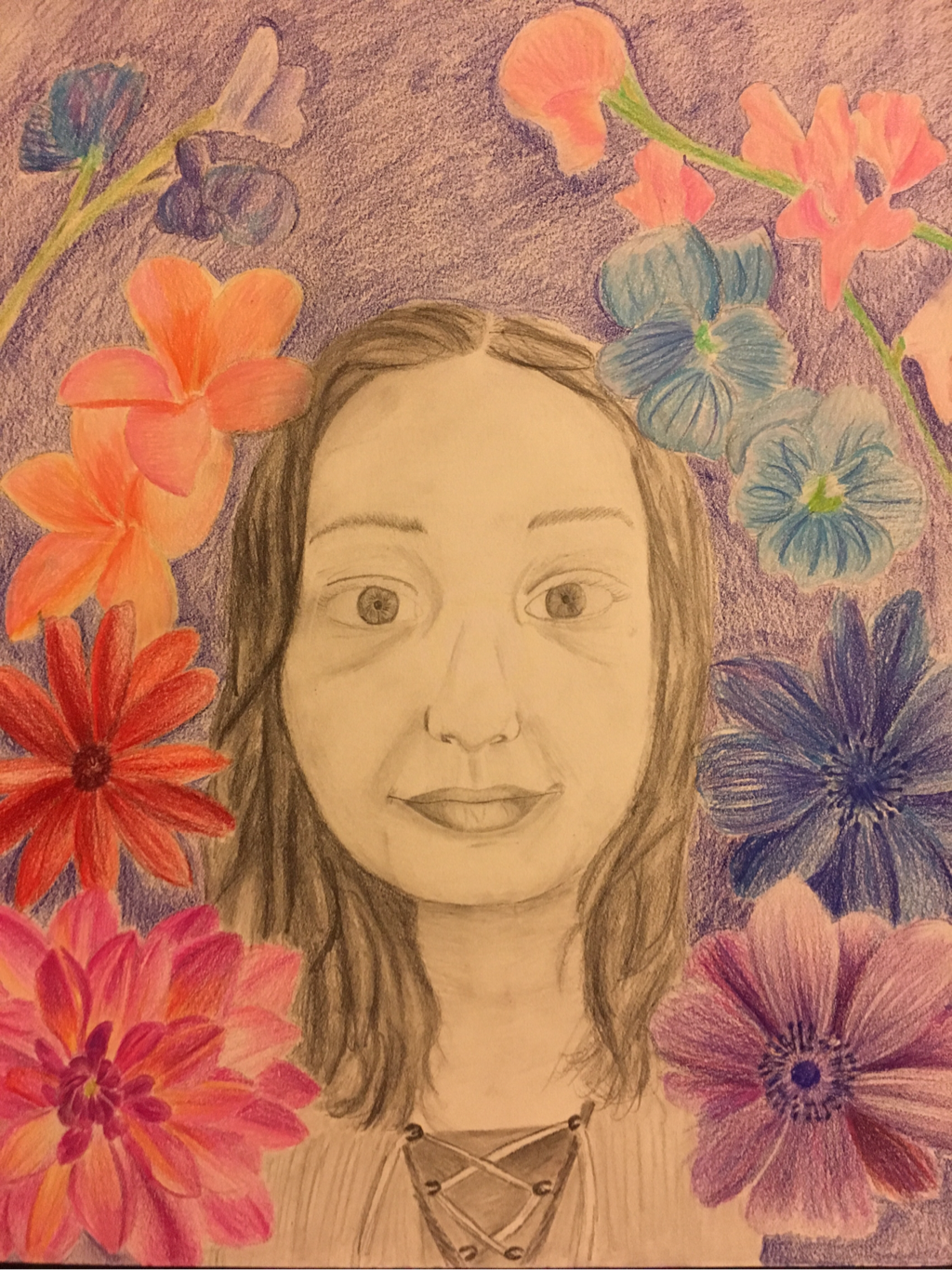
For my self portrait I chose to make it expressive. I decided to use 2 mediums: pencil and colored pencils. I feel like my execution was very poor, and this is partly because it took me a long time to decide what I was going to do. By the time I started I had to rush to get it finished. I think that my flowers are the best part of my piece because I used value, and made them look realistic. If I could change my background I would have possibly changed the color, and added more value/shading. I think that my face has decent value, but I could've added more to give it better depth. I had a hard time making the head the right size, so that's why it is so small in relation to the whole paper. I felt that I had too much empty space, so that's why I included so many flowers. If I were to redo this project I would have made my face bigger, and also add more value so that it didn't look so flat. I chose this portrait style because I felt that the flowers would pull everything together, even though I had a simple expression. I think the most important aesthetic quality of my piece is the flowers because they're neat, and look realistic. I don't think my drawing evokes very much feeling/expression. My face is very plain, and I'm not showing much emotion. If I were to do this again I would probably do a different facial expression, but still do the background the same. I feel that the qualities that made my piece successful are the colors I used in the flowers, and my shading technique in my hair. I feel the qualities that made my piece a failure is the background color, and the shading of my face, as stated above. Comparing my piece to other ones in the class, I think that mine was lacking, and could use much improvement. Looking at others I noticed that they were able to add more value, making their faces look more realistic. I think that my work is fairly original, but I somehow could've made it more of my own. I think that flowers are overdone, and that my idea could've been more creative.
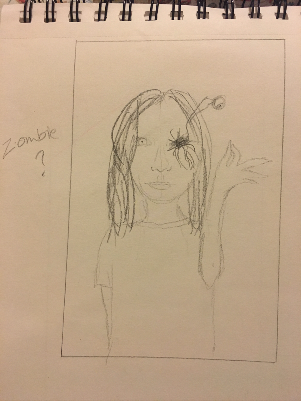
I did not try on my sketches. I already knew what I wanted to do by the time I got to them.
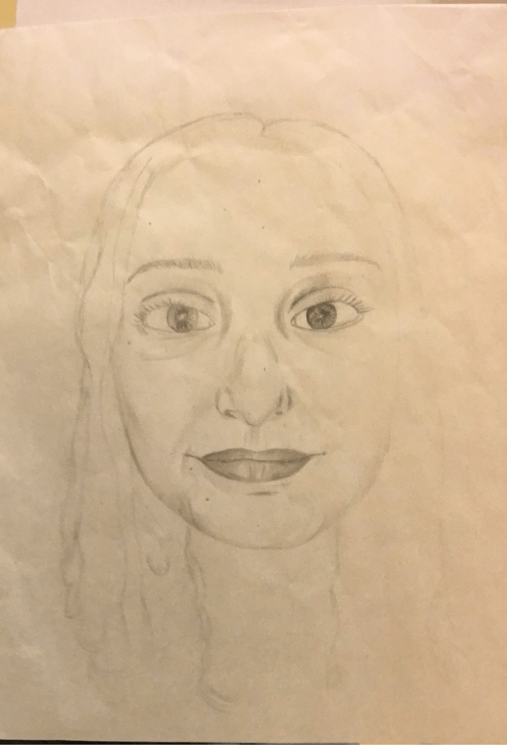
Facial drawings
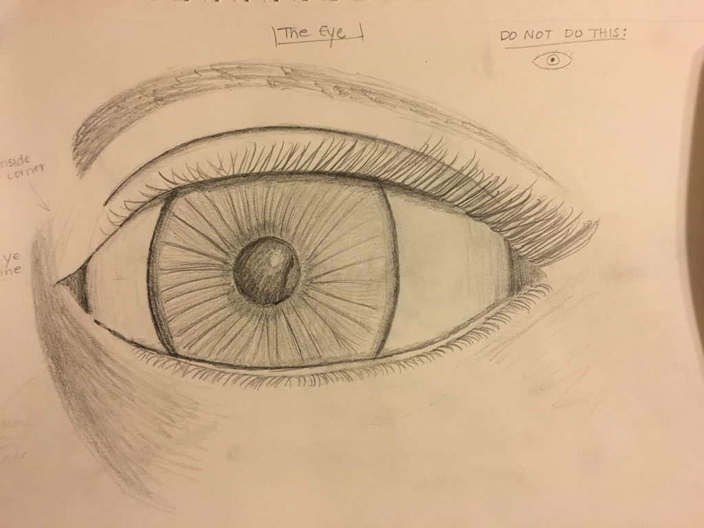
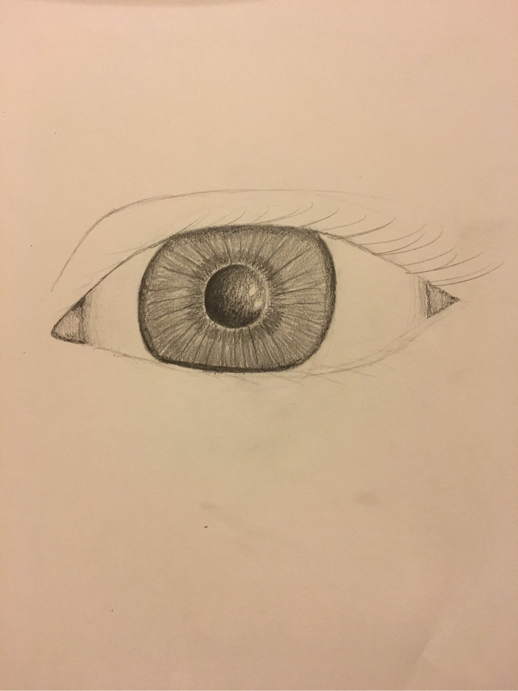
Drawing eyes is one of my favorite facial features to draw. Although I am not very good at it, I still enjoy drawing them. I would say that spending a whole day on learning how to draw eyes really helped me, and made me more successful.
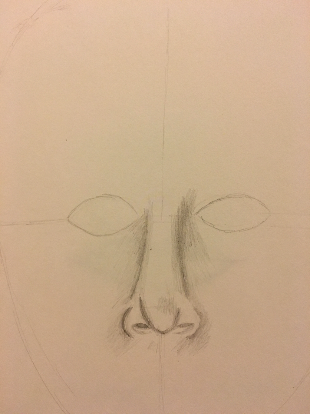
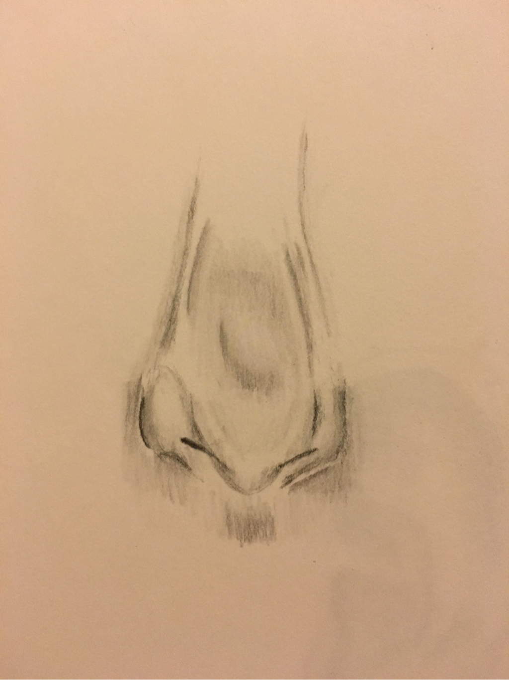
I don't think I did very well with drawing my nose. It was very difficult for me, and I had a hard time shading and blending it to make it look realistic. Overall I would say noses are my least favorite facial feature to draw.
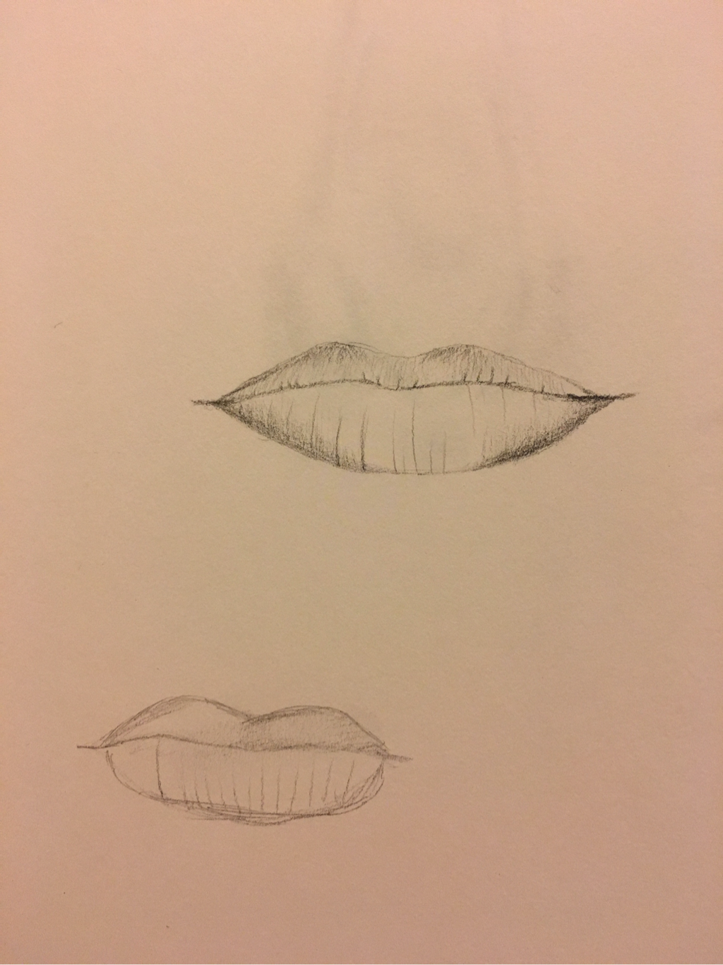
I'm terrible at drawing lips. I think these look terrible, and they are quite embarrassing. Although these look bad, it was good practice for when I started my final portrait.
Skull drawing
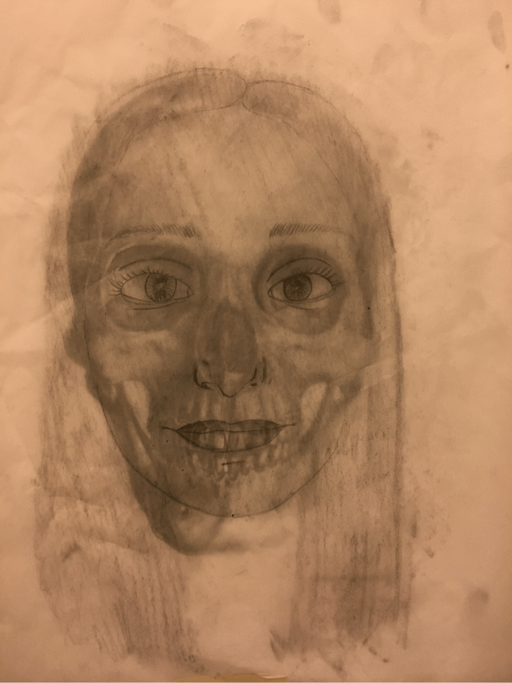
For this assignment we were supposed to draw our face on a piece of tracing paper, and draw it on top of a skull. By doing this, it helped me to get my proportions right, and made my face look more realistic. Overall, I think that this activity was very beneficial.
Opacity
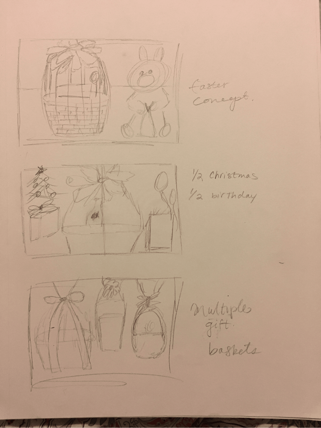
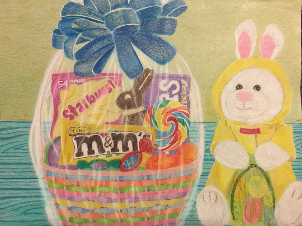
1. I think the craftmanship of my drawing is neat, but I feel that it is lacking depth in some areas. I think I did a good job with choosing colors, but overall my execution was not great. I think I should have added more value to create shadows where the items are placed on the table.
2. I feel that by using a blue green color for the wooden table, it made the piece look more vibrant, and made it look better. To create the wood effect I started with a light teal and added other greens and blues to build on top. I believe it made that piece pop, and I think it was a good choice.
3. I used many different colors in the art piece. As stated above, I believe that by using a blue color for the wood, I think it made the piece pop. Also, I like the variations of colors I used to create the easter basket. Overall I think I did a good job choosing colors.
4. I created contrast in my drawing by using the white prismacolor to create the plastic/wrap look. I believe by using the white it made it stand out more, and you can see a clear difference.
5. To create texture in the basket I used different shades of the colors to create a more realistic look. I also created texture in the table by making it look wooden. I believe that my bunny could have used more texture, but was difficult to execute that.
6. For the background I chose to make the walls a light green. I feel that this tied every color together, but didn't make it look too busy. I feel that it was a good color to pair with the teal of the table, and that it turned out good. I thought about adding a picture or two to the wall, but felt that would have made it look to cluttered.
7. It is important to understand the medium you are using because you want your piece to be successful. For my piece I used prismacolor, which I was very familiar with because I had used them for the project we did prior to this one. If i were to give one tip I would say that you shouldn't start out dark, but should build up to it instead. By working in layers it gives it a more realistic look, and overall makes it look cleaner.
8. I would say that I had a difficult time making the gift wrap appear clear. I used the white prismacolor to do this, but struggled to make it look right. I think that in order to improve my piece I would have to make it look more opaque, and redo the bag that the bunny is holding.
Candy final
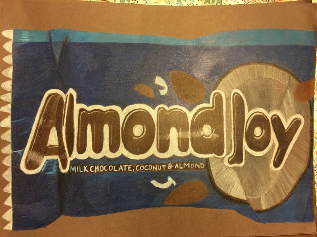
For this assignment we were given a piece of candy of some sort. I chose almond joy because I thought it would be fun to add the blues, and give it a pop of color. Overall I think I did decent on this assignment, and definitely improved from the lollipop project.
Dum Dum final
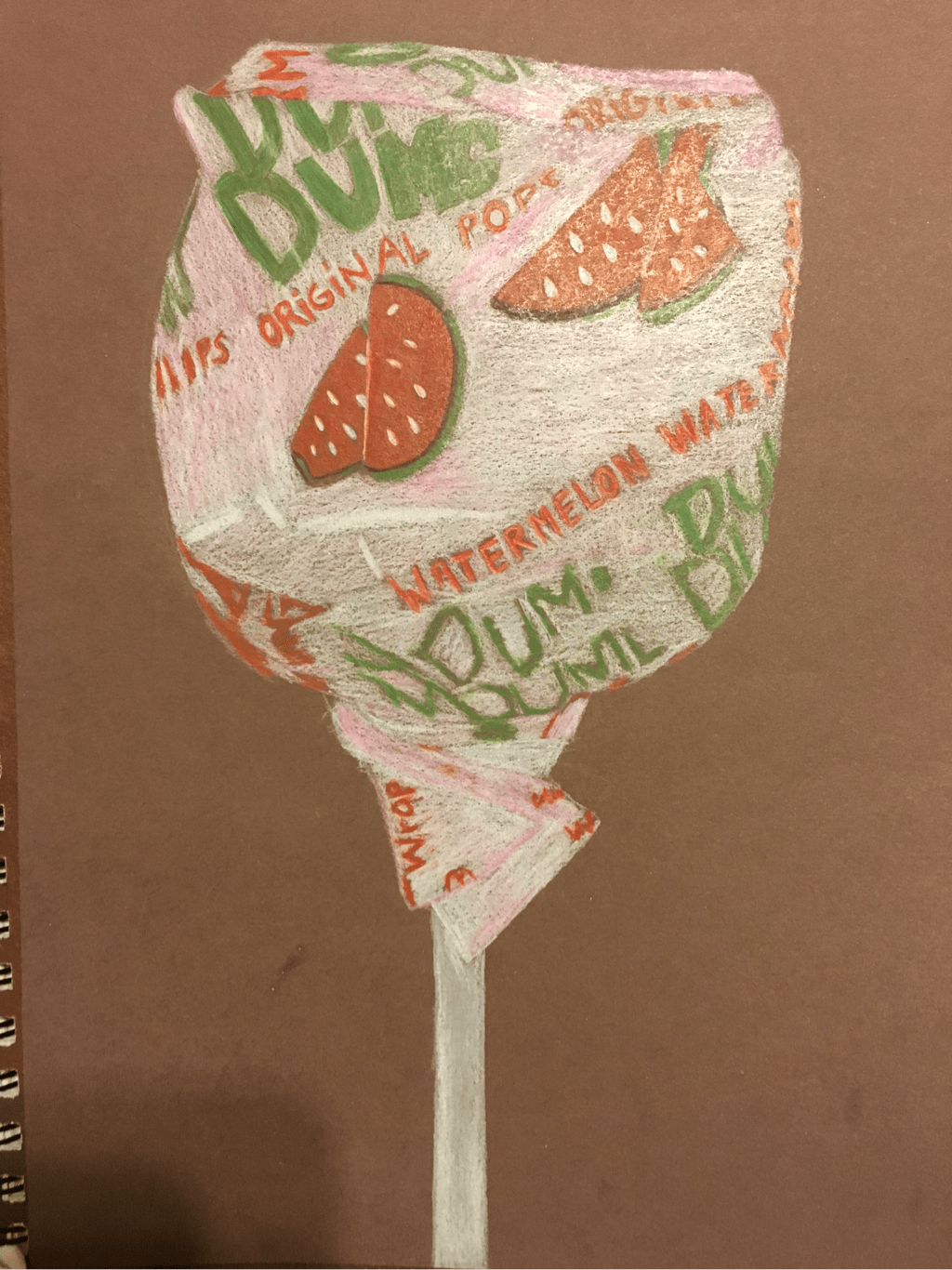
For this assignment we were supposed to draw a dum dum with Prismacolors. I feel that with this project I rushed, and if I had taken my time it would've looked much better. Although it didn't come out how I had hoped, I still enjoyed drawing it because colored pencils are my favorite medium.
Smartie final
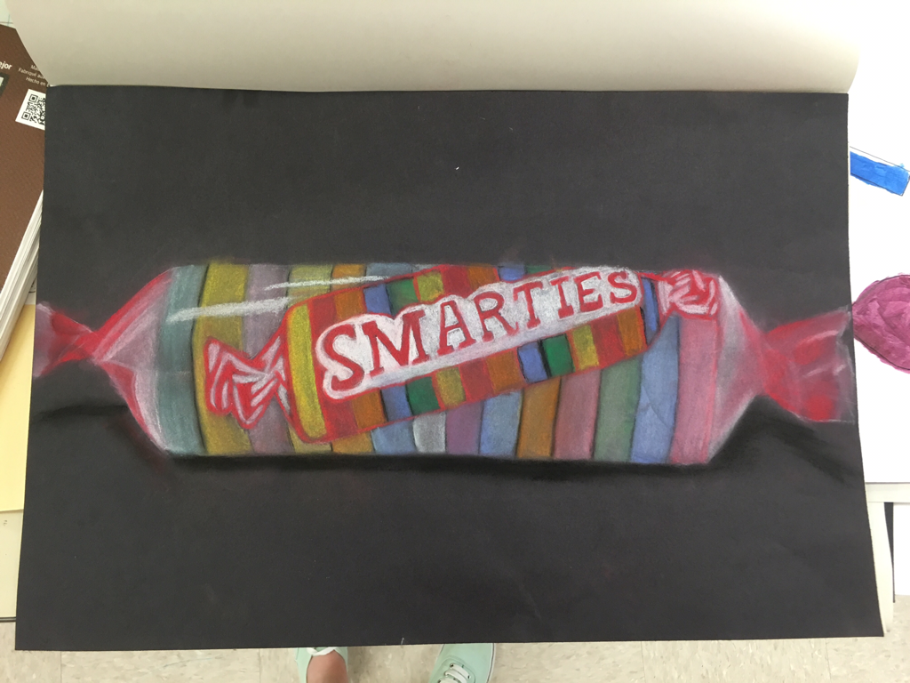
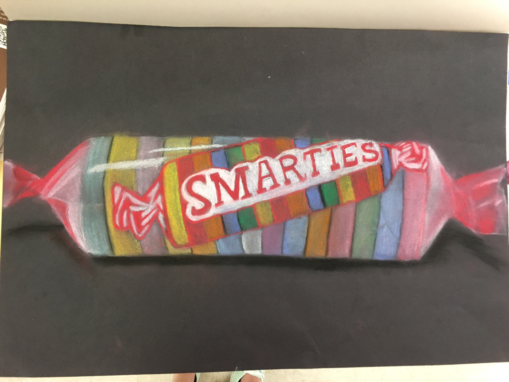
For this assignment we used chalk pastels to create our smarties. This was my first time using this medium, but overall I enjoyed it very much. I found it difficult to get vibrant colors with the pastels when drawing on the black paper. I feel that my piece came out looking dirty because I used too much pastel, and didn't blend it correctly. Considering I had never used chalk pastels before, I think I did a fairly decent job.
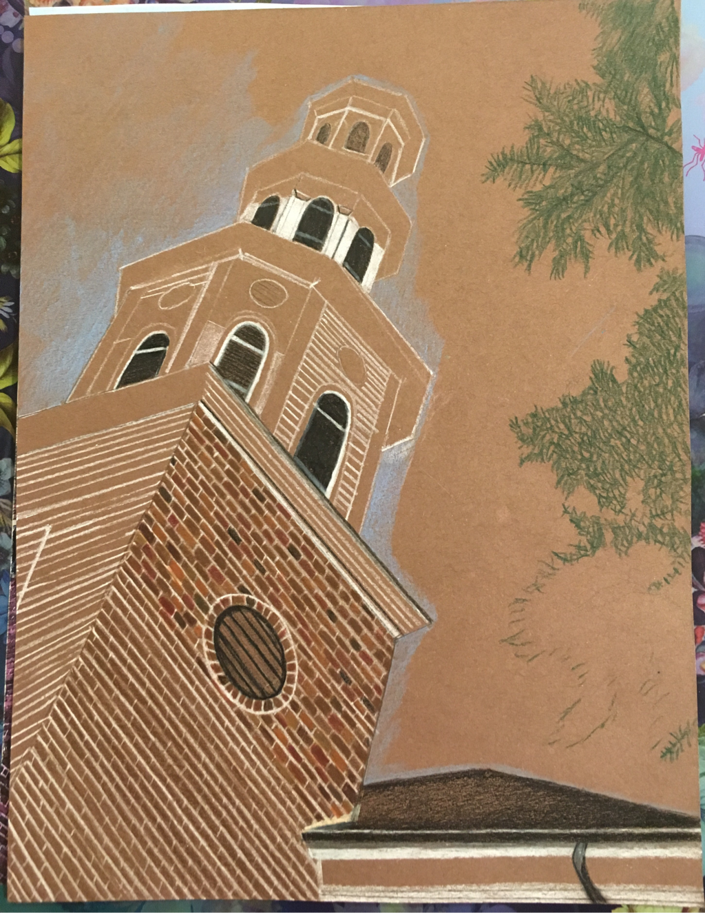
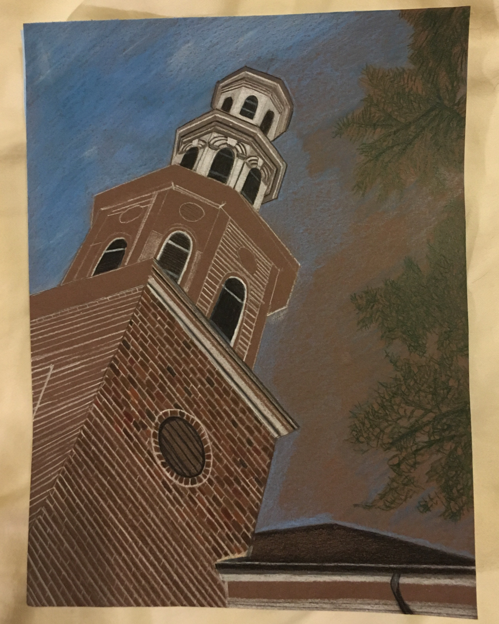
Look at That View
|
|
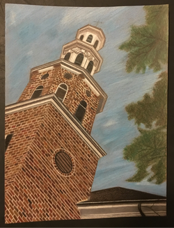
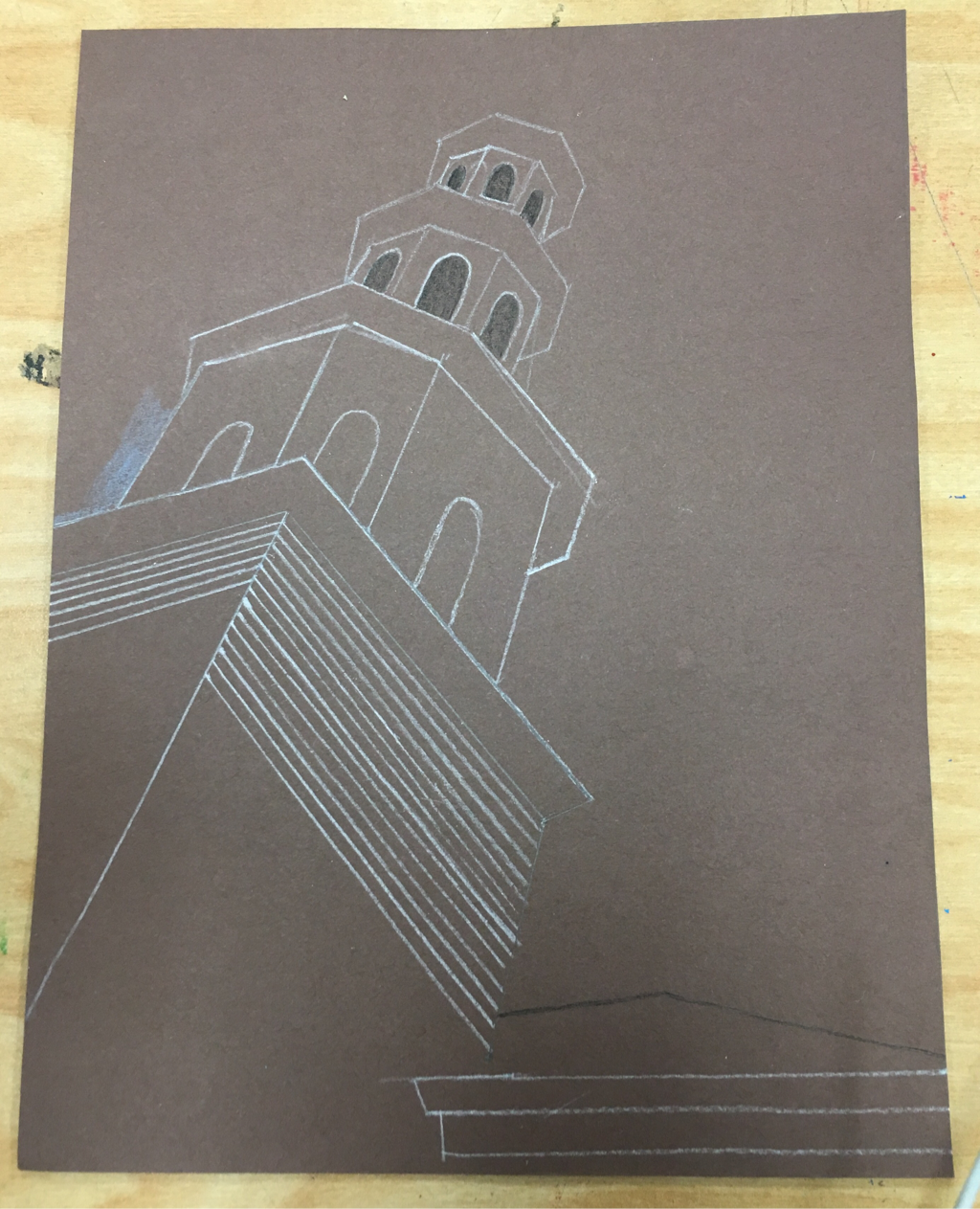
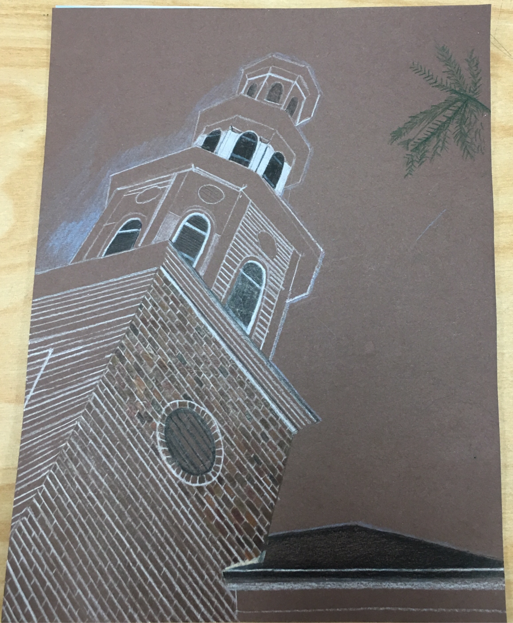
1. I created an interesting point of view because my picture is of a church in Washinton D.C., but I am looking up at it from an angle. I believe that my piece was successful because I got the proportions right, and I feel that I put a lot of detail into it. Also, I really like my point of view, and the angle that the picture was taken from.
2. It is important to understand perspective and how to draw it because it makes your art piece look more realistic, but also more interesting. If perspective is done correctly, it will draw your eye to different parts of the piece, and will make it more engaging. I think it is important to know how to draw perspective because you want your work to look nice, but it’s also a good basis for drawing many other things.
3. I think the colored pencil exercises were important because they were very helpful in figuring out how to use them, and overall was a good practice. I think that I got a good feel for how they worked, and also if I hadn’t done the practice, my project wouldn’t have come out as good as it did.
4. One technique I used were starting out by coloring light, and building on the value. I learned in the process that you can’t immediately start coloring dark, or else it will not come out right. I think that keeping this in mind really helped me out.
5. I think that I was able to show depth because I did have a foreground and a background. By including the sky in my picture I feel that it gives it more depth, and that it makes it look more realistic. I feel that my picture might not look real, but it does look nice.
6. I really enjoyed using colored pencils, and would definitely use them again. I feel that this project in general was very enjoyable, and I learned a lot about how to use prismacolors. I think some obstacles I faced were making sure that my lines were straight when I created my building, and also coming up with the correct colors for some of the different parts of the project.
7. I don’t think that I needed to be taught anything else, and I think prismacolors are fairly easy to get the grasp of. I think that I was prepared for this project because we practiced with the colored pencils prior to starting our final project. Not only did we draw still life with the pencils, we also got to do a sketch with the pencils, which helped a lot with the process of figuring out how to use them. Overall, I enjoyed this project very much.
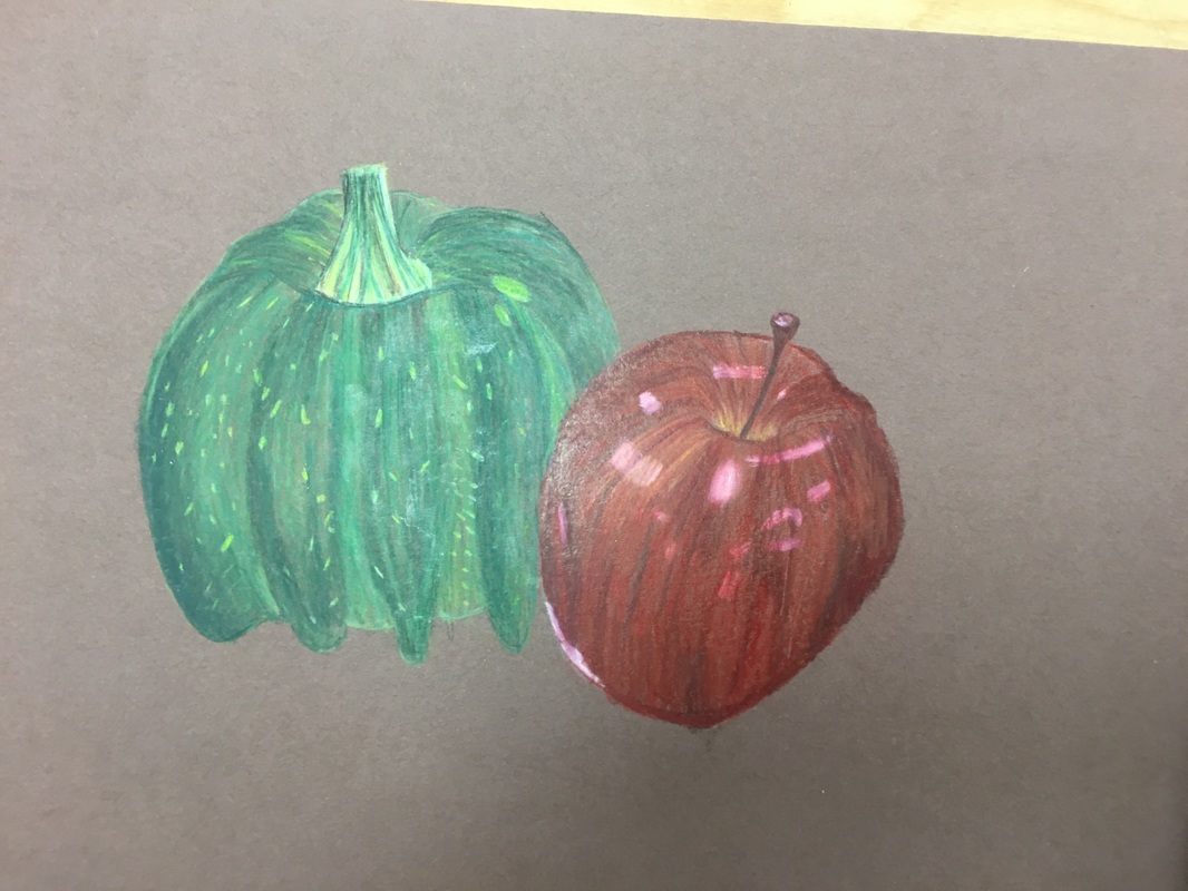
Colored Pencil Studies
|
|
|
|
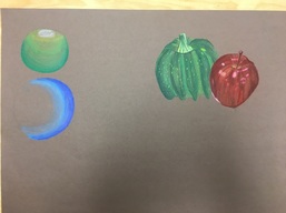
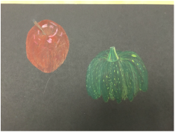
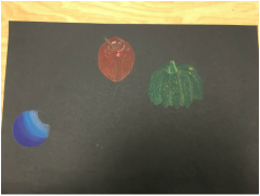
Our assignment was to practice using prismacolors on brown and black paper. For this assignment we first had to draw spheres, and then we had to draw the still life in front of us. On our table we had to draw an apple and a gord. I found that it was much easier to color on the brown paper, and overall I liked it more. I also feel that this was good practice because it taught me how to use the colored pencils, but also how to do it on colored paper. I think that this was a good assignment to do, and I thought it was fun.
Ribbon
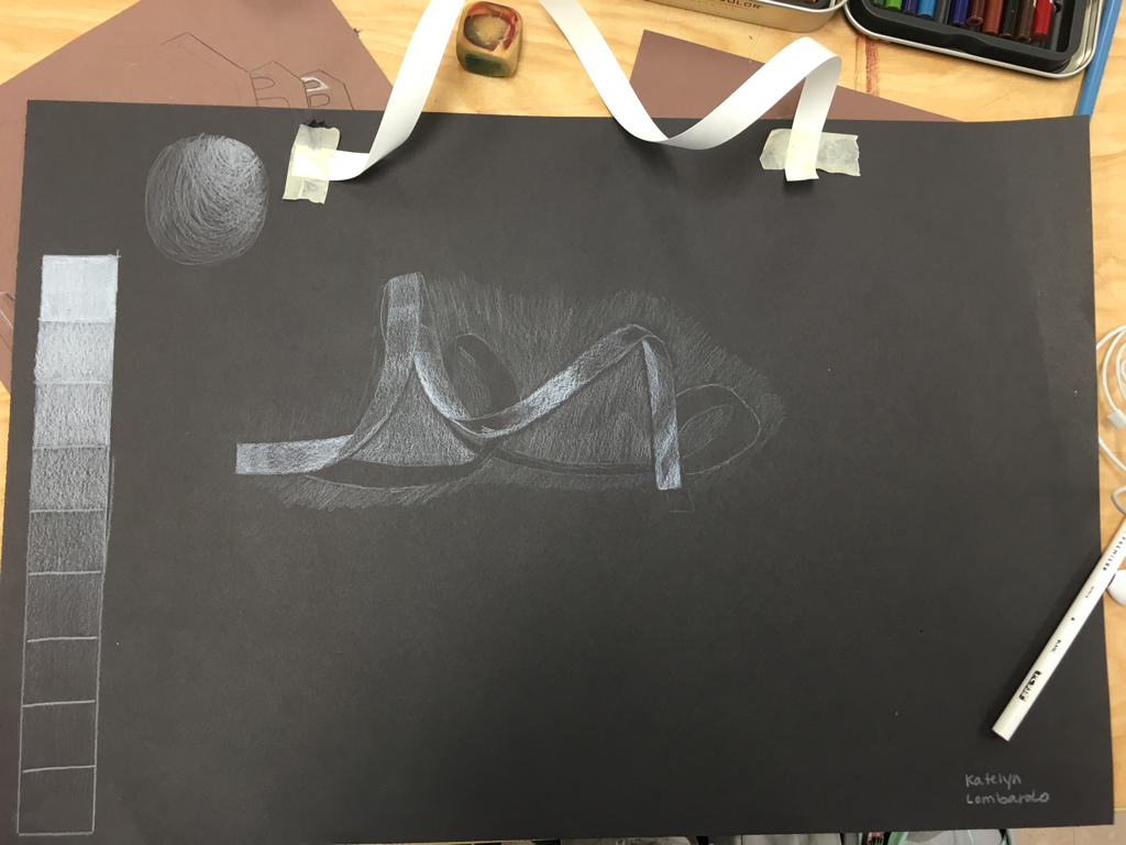
For this activity we were to draw a ribbon, and also make a value chart using a white prismacolor on black paper. The difficult thing about this project was that it was opposite of using a normal pencil. In order to create the "darks" you had to use more of the white, and in order to create the shadow, you had to use the dark of the paper. I feel the hardest part of this assignment was creating the shadow of the ribbon. I also attempted to make a sphere, but gave up because it was too hard. Overall, I feel that if I did this again I could do much better, given that I now better understand how to do it.
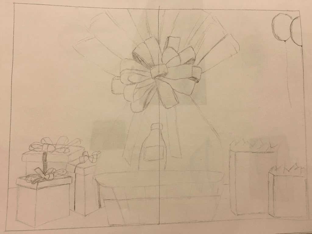
Still Life Drawing
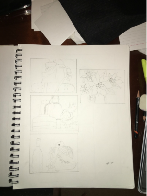
|
|
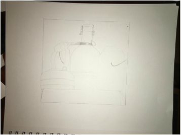
For the still life drawing we first had to start with four sketches of the different objects in the still life. Once we chose the area that we liked, we had to make a final sketch that would be pretty similar to the final project.
This is an in-progress picture of my still life drawing.
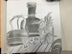
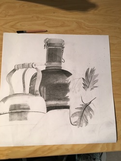
1. I feel that my drawing is very clear, clean, blended well, and I also used my space fairly well. I think that my values look good, and that I made it look realistic. I think I used a good range of lights and darks, which made it look much better. Along with that I feel like I blended everything pretty well.
2. I think that my values are realistic and that I used a good variety of lights and darks. As for my shadows, I don't have very many. That would be one of the main things i would improve on. I have a shadow under the tea kettle, which I think looks good, but that is about it. I should have added shadows under the mason jar, and also where the ribbon is touching the fabric.
3. Yes, there is a clear source of lighting. You can see in my tea kettle and also the vase looking thing that there is a light source. The light source was coming from above.
4. I think the compositional sketches were vital to this project because it gave me a good idea of what angle I wanted to draw from, and also what I items I was best at drawing. After figuring out what to draw, it was good to draw different angles to ensure that you used the space of your paper in the best way.
5. Again, I would say my final drawing is successful because I used a wide range of values, and I also used the space of the paper well. I also think that I blended everything well, so it made it look cleaner and neater.
6. I think the proportions of my drawing are correct, and that everything looks right. The tea kettle and mason jar were in front of the vase, which I think I was able to execute that look.
7. The placement and grouping of objects does create a pleasing arrangement because it doesn't look cluttered, but I also used a good amount of objects in the drawing, so it doesn't look bare either.
8. There isn't really a center of interest in my drawing, but I feel that my fabric has good movement, so your eyes are constantly looking at something different. 9. I never manage my time very well, and I tend to be very slow when it comes to drawing anything. I was able to finish almost everything in class, but had to work on it for about 20 minutes at home. I feel that I should learn to speed up my process of drawing, but I shouldn't rush because my work might come out sloppy. Overall I feel that this is the area I need to improve the most in.
10. Some challenges I encountered during this project was that adding darker values was sometimes difficult. The vase in the back was the darkest item, and it took a lot of time to make it look darker than the other stuff. Also it was difficult to add shadows to the tea kettle. I feel that in the end it came out fine, but starting it was very difficult.
11. Overall I have learned that you should pay attention to shadows and your light source, and also making sure that you include details in your art. I think that this has been my favorite project so far.
Fabric Drawings
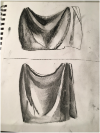
The top drawing I used a charcoal pencil, while the bottom picture I used vine charcoal. This was my first sketch using the charcoal, so it was definitely different. I feel that this assignment didn't turn out great, but as I used the charcoal more, I got more used to it, and I definitely improved. The point of this was to draw a small section of the fabric using both the vine charcoal, and also the pencil. I would say that overall I enjoyed using this medium, and trying some new.
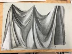
1. For this fabric project I feel that I did use a wide range of values, but it could have been better. In my drawing I have very light values, but I feel that I could have gone darker in some places, making it look more realistic. I wouldn't say that I have a range of 9 different values because i used more of the middle colors.
2. I think my understanding of value helped contribute to my piece because I knew where to add the darks and lights, which helped me make the piece look more realistic.
3. I feel that although my fabric could have blended better, I do have pretty decent transitions. In order to create the real dark parts of the fabric, I first outlined the area with the charcoal pencil, because that tends to be a lot darker. After doing that, I went in with the vine charcoal and pressed hard, in order to get a darker value. For the lighter values I used the white charcoal pencil to make it pop, and also used a little bit of the normal charcoal to give a gray effect.
4. Interpretation of texture is essential in capturing the look of the fabric because it shows the folds, but also how the fabric is soft and smooth. In order to create this look you have to make sure your strokes are smooth, and that you also blend them.
5. If I could recreate my piece again I would definitely make sure that I blended everything better, so there's not such a drastic change between the values. I also think I could manage to add darker values, which would enhance the look of the fabric. Lastly, I would make sure that I took a picture of the actual fabric. I wasn't able to finish the project in class so I had to take it home, but it was difficult to do it without a reference picture. I feel that I did okay considering I had to improvise, but I definitely learned that I need to take pictures of everything.
Value Studies
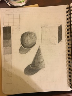
Our assignment for this value studies assignment was to practice making shapes look realistic by using value. Along with the shapes I also drew a value chart, starting with darks and ending with lights. I feel I could have taken more time and done much better on this assignment, it is definitely not my best.
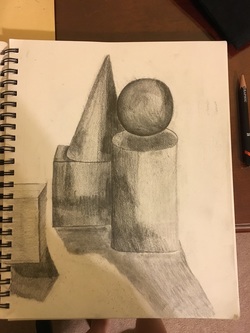
For our value studies final we were supposed to arrange five different shapes on our table and draw it from our perspective. I feel that this is one of the worst projects I have done so far, but it was really good practice. By doing this assignment I feel like I improved on making things look more realistic, especially when I did my still life project. Overall, I enjoyed doing this drawing but if I were to do it over again I would improve the shadows, and make sure the shading was blended better.
Contour Room Drawing
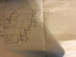
Originally I had decided to draw the corner of the room where the door is... I just couldn't seem to get the proportions right, so I decided to move onto the side of the room where the cabinets and sinks are. I believe that I should have stuck with my original place to challenge myself more.
This is a picture of my draft of the side of the room. Unfortunately it is not good, and I was unable to finish. Although i could not finish it, it was a good start for my final product, and I got a feel for how everything should be placed.
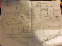
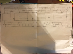
This is the picture of my finished product of my contour room drawing. The assignment was to draw a part of the art room using contour lines, and not picking up our pens. I believe I did use a fluid line because I didn't pick up my pen, and I made sure that all the details were connected. Also, I don't think that my picture looks like I sketched, which some of my other drawings did. I think that by practicing drawing parts of the room before I did my final helped me tremendously because I got a feel for how I should draw certain sections, and also I had to get used to not picking up my pen. The difference between a contour line drawing and an outline drawing is that contour line focuses on the details of a picture, as opposed to an outline, which focuses more on the outside of an object. My interpretation of line is essential in capturing the look of the room because it shows every little detail of the objects on the shelves, but also just makes it look more realistic. By doing this drawing I correctly learned how to do a contour drawing, and making sure that I follow my eyes and draw at a steady pace when looking at an object. I think that if I were to redo this project I would choose a different angle or part of the room. I regret not going with my original part of the room, but in the end I am still satisfied with the outcome. I would also make sure to use a fluid line, and not sketch as much.
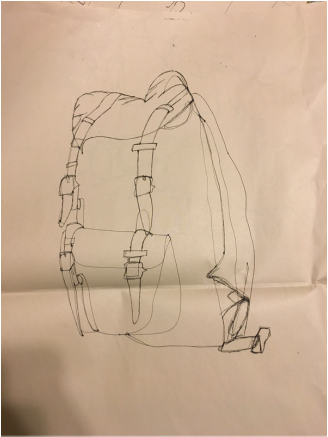
Modified Contour Drawing-Backpack
For this drawing we were told to place one backpack on the table, and draw it from the perspective we were sitting at. We were supposed to draw a life-sized version of it (which mine did not come out the size I had hoped) and we could not pick up our pen as usual. I feel that my final product was okay, but if I had taken my time, it would have come out much better. Also, I need to make sure that my lines are more fluid because I tend to start sketching when I do contour line drawings.
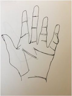
Modified Contour Drawings
This was my first modified drawing that I did. For this we were allowed to look at our paper while drawing, but we still couldn't pick up our pen.
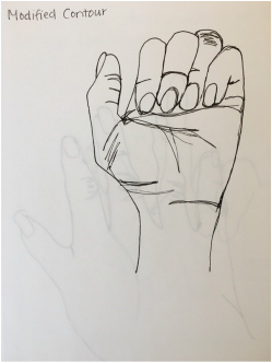
Second modified drawing
I feel my second modified drawing was better because it was more proportionate. I think if I were to do it again, I would make sure my lines were more fluid.
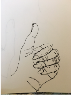
Third modified drawing
This was my final modified drawing that I did. I feel that it is my best one, and that I improved quite a bit.
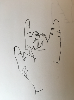
Blind Contour Drawings
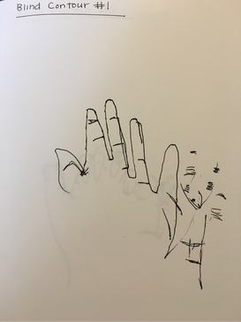
First blind drawing
This is a picture of the first blind contour drawing I did in this class. We had to draw our hand, but without looking at our paper, or lifting up our pencil. It is by far the worst I have ever done, but is okay considering it was my first time.
Second blind drawing
This is the second blind drawing I did. It is certainly not proportional. Although it is not great, it is definitely an improvement from my first one. And I was learning that I need to slow down and draw everything that my eye sees.
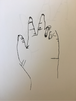
Final blind drawing
This was the final blind drawing that I did. I would say it is my best one. I can see a big improvement, and it taught me that I should slow down and take my time when doing a drawing like this.